The use of bars and conditional formatting to visualise table data has been part of CRM Analytics for a long time — and it remains genuinely useful. But with the introduction of the Image option in table column properties, there is now a more powerful technique available: embedding images — animated or otherwise — directly inside table cells using a SAQL case statement.
The result is a table that does not just display numbers, but immediately signals meaning. An animated upward arrow for positive trend. A flashing red indicator for a metric below threshold. The reader's eye goes straight to what matters — no legend required.
Here is the complete 5-step process.


Before anything else, your images need to live inside your Salesforce org. Log in to your Salesforce instance, navigate to Files, and open the Library option in the left-hand menu.
Select a library (or use the default) and click Add Files. You can upload any image file here — standard PNG or JPG for static indicators, or animated GIF files for movement. Upload both images you plan to use (for example, an upward green arrow and a downward red arrow).
arrow-up-green.gif, arrow-down-red.gif). This makes them much easier to identify when you copy their URLs in Step 2.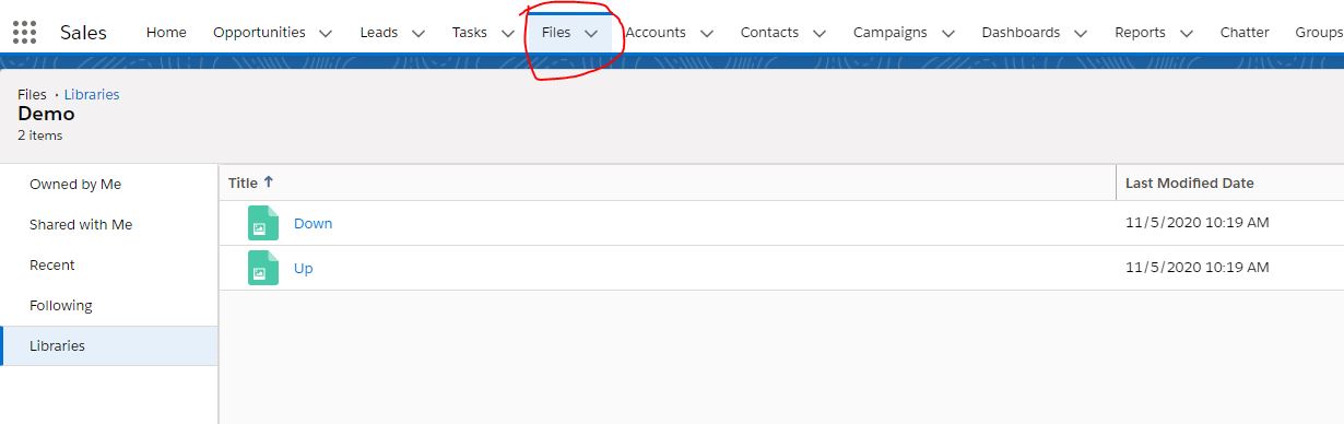
Once uploaded, click to preview each image. Right-click on the image and select Copy image address (the exact wording varies slightly by browser).
Paste each URL into a text editor immediately — you will need both URLs for the SAQL case statement in Step 4. These are the direct CDN links to your images inside Salesforce, so they will work in the table widget without any additional configuration.
Create a new dashboard and add a table widget. Switch the query into SAQL mode — this technique works with Values tables and Compare tables only (not pivot tables).
In the example below, a Compare table uses the DTC Opportunity dataset with one attribute and two measures: Current Year (CY) Sales and Last Year (LY) Sales. The goal is to add a third column that shows an animated directional arrow based on whether CY Sales is above or below LY Sales.
Update the SAQL query by adding a third computed column. Use a case when expression to conditionally assign one image URL or the other based on your comparison condition. The column value is a string — the URL to the image you uploaded in Steps 1 and 2.
case
  when <condition> then "URL_1"
  else "URL_2"
end as "Arrow"
Replace <condition> with your actual comparison — for example 'CY_Sales' > 'LY_Sales'. Replace URL_1 and URL_2 with the full image addresses you copied in Step 2.
Run the query. The third column should now show the raw image URLs as text strings — that is expected at this stage. The final step converts them to actual images.
Switch to Design mode in the dashboard builder. Select the table widget and open the right-hand properties panel. Click the Column tab and select your Arrow column (the one containing the URLs).
Find the Show Data As property and change the value from Value to Image.
The column instantly renders the URLs as images — animated GIFs will play automatically. Your table now shows directional animated arrows in every row based on whether the condition was met.
Your plain, simple table is now showing animated insights. The data hasn’t changed — but what the reader sees in the first second has.